
Rebranding After Five Decades
- imtrafficker

- May 15, 2020
- 10 min read

The origins of one of the most well-known chocolate brands in the world and the second-largest confectionery brand in the world dating back to 1824 when it was established. Started as a single branch grocery store owned by John Cadbury in Birmingham where they sold coffee, tea, and drinking chocolate. In the early 1900s, they first introduced the legendary and its signature dairy milk chocolate bar which took the world by a storm and forever changing the fate of the company which is now headquartered in Uxbridge, west London, wholly owned by Mondelez International and currently operating in more than 50 countries worldwide.

Now, look at what is rebranding?
The process of changing the corporate image of an organization or a product can be termed as Rebranding. But this corporate image includes many small cues that make and build a brand. These cues are the ways through which a customer identifies oneself with the brand that helps in the creation of brand association which in the long term period leads to what we call brand resonance, the ultimate objective of every organization and brand out there. This rebranding thus specifically doesn't refer to a single image change of the particular brand or organization but a holistic transformation of itself. It is a market strategy of giving a new name, symbol, evolution in design, jingle, maybe a new tag line, or a fusion of these. These are the cues that help the brand connect with a customer increasing the brand recall and the recognition capability.
So why do we need Rebranding, especially for a famous and established brand like Cadbury that has been ruling the confectionery market for about more than a century now?
The idea or a basic motive behind rebranding is to create a different identity for a brand, that differentiates it. This happens when there are too many identical products in the market of various brands with mainly homogeneous characteristics and focussed at serving the same purpose targeted at the same set of audience or better to say with the same target segment. In these type of situations, an already established brand having a higher connect with customers can take the risk to break free from the clutter and come up something unique and more specialized and customized offering that will help the brand position itself away from its competitors and also will be able to form a positive (not always) brand perception by being able to connect it with its customer segment or target audience. But one should keep in mind rebranding is a risky strategy as there will always be a possibility that the consumers might not like the new brand.
The other reasons for rebranding include:
New locations: Expansion to international markets. It might happen the county or new territory your brand is about to enter doesn't identify with the brand's color, or logo or, message. E.g. 1) Ford seemed to have a problem in Brazil where sales of the Pinto flopped. On investigation, the company found out that Pinto was Brazilian slang. 2)When Pepsi started a marketing campaign in Taiwan, the translation of the Pepsi slogan "Come Alive with the Pepsi Generation" came out as "Pepsi will bring your ancestors back from the dead."
Market Repositioning: Supposedly you want to target a completely new segment or a completely new customer profile - whether through the 4ps- your brand needs to follow suit.
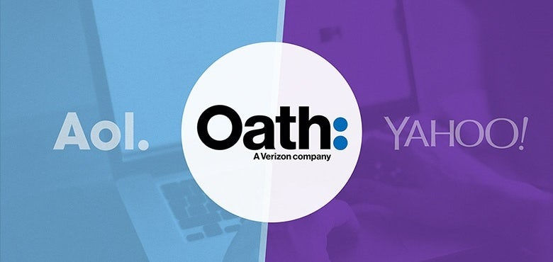
Merger and Acquisitions: The occasion where there is a unification between two or more companies, the respective brands also come together as well. Battling with the other brands of the same company may prove to be harmful to the image of the company and brands as well. The clever move will be to find a new brand together that reflects the new entity which in order will prevent, further tensions in between brands and confusion that will lead to building trust. (Refer Yahoo-AOL merger part later in the section)
New Philosophy: Your business’s mission, vision, and values should govern every decision you make -- including brand decisions. If your MVV's are shifting and pivoting the direction of your business along with them, you’ll need to reevaluate your brand.
So, there are mainly two forms of rebranding.
1. Proactive: Proactive rebranding is done when a company recognizes that there is an opportunity to grow, innovate, tap into new businesses or customers, and to reconnect with its users.
2. Reactive: Reactive rebranding is done in a situation when the existing brand has been discontinued or changed. Possible reasons for such an action could be mergers & acquisitions, legal issues, negative publicity such as fraud, aiming to beat the competition or create your niche.
The history of rebranding and other examples:
Needing to rebrand is not a bad sign; on the contrary! Most successful companies do it, from startups to those on the Fortune 500. Often, a rebrand means that the company has evolved beyond its previous identity and is now ready to reach new heights. Rebranding offers a great opportunity to strengthen the company’s presence and image in the eyes of your customers, however, it can be an effort-intensive process.
So, let's start with one of the world's most iconic company that has been transforming their look over the last few decades:

Next, we take an example of a sports company that has successfully rebranded itself over the years, to be more appealing to the millennial crowd.
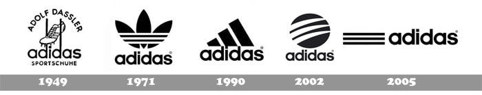
In 1997, the German shoe manufacturer introduced its new corporate symbol, with three slanting stripes forming a steep mountain. The mountain stood for the challenges faced by the company and the goals it’s pursuing and is still the logo that is used widely all across the world.
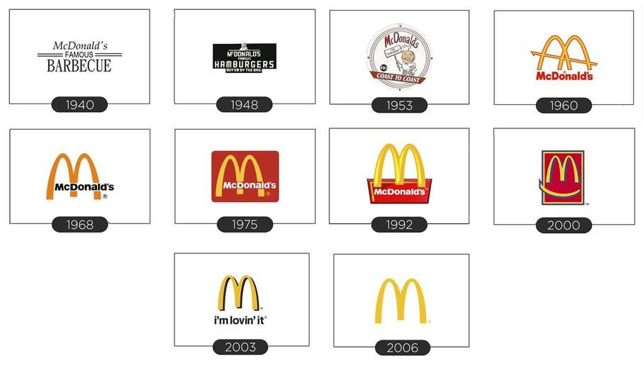
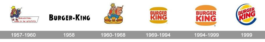
New competition, technological shifts, or taste trends have many times led to rebranding strategies of many big players in the food and beverage industry. Some of which are worth mentioning are:
McDonald’s
Burger King
Coca-Cola

Pepsi

There are times when the business changes in a significant way like your company may have pivoted, expanded into new product lines, entered international markets, or acquired/merged with another company. Both the brands need to reflect these significant changes, and not be left behind to represent the respective company’s past identity.
Such was the case with Yahoo when they merged with AOL.
The two examples can be:
Airbnb

Oneplus

Or in some other scenarios, it might be a situation where your brand is dated. After many years in business, your branding may not feel as contemporary as it should. For example,
Microsoft

Google
The next section will be on what was the logo that Cadbury had and what has changed in the rebranding.

Cadbury's old vs present
The last time Cadbury went for a revamp was back in 2013 with the help from world-renowned brand design agency Pearlfisher.

The previous brand redesign was based on the grounds of creativity, inspiration, bringing back its joyful behavior along with a celebration dedicated to the specialness of its heritage.

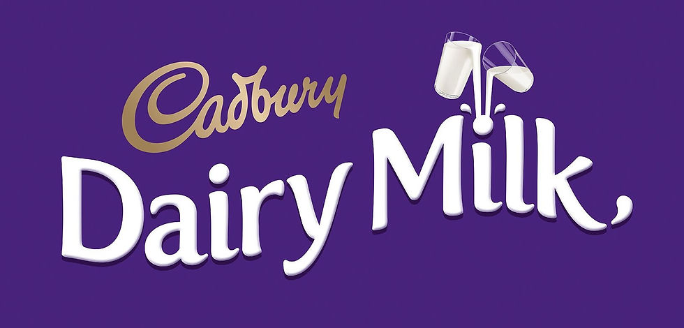
Cadbury got a brand new logo and a packaging that was last altered in 1999-2000. The picture besides depicts the transformation process of Cadbury's logos and packaging through the years with their iconic Cadbury dairy milk chocolate bar.
Interestingly, the logo of the brand has remained the same throughout 1951. And after more than 50 years later the 'Cadbury' signature has been tweaked a bit but maintaining consistency with the previous logo. We will get into the details of the new logo in the latter part of the article. Now, let's look at a visual designed by Pearlfisher back in 2013 that gives tribute to the old packaging and also sets the path for the new one.
Let's look at the visual designed by Pearlfisher.
Pearlfisher was tasked with bringing the character of over 50 global variants of Cadbury Dairy Milk to life with a new visual identity system that would be globally recognized but flexible enough to accommodate cultural nuances and local tastes. Inspired by the creative idea of ‘See the Joy’, they replaced product shots with imaginative, playful flavor expressions and gave each variant its own personality and creates a living, breathing identity that extends beyond packaging. In addition to that, they also redesigned Cadbury Buttons and Giant Buttons, and created a brand for Cadbury Glow asserted Cadbury as the creator of premium chocolate gifting in the Indian market.
The logo designed by Pearlfisher specifically focussed on 'The Cadbury Glass and a Half logo', which has been updated by them and brighter colors have been introduced to improve on-shelf presence.
Cadbury that time said, the new look is the 21st major redesign since it launched Dairy Milk 108 years ago, and creates ‘a more modern and joyful look, while proudly keeping the identity that has been a part of its heritage since 1905’.
‘With our new packaging, we hope to bring out the personality of the Cadbury Dairy Milk brand in a generous, optimistic, and spontaneous design, while celebrating the links with our past.’ -Matthew Williams, Marketing Dir. Cadbury
Now after spending a hefty amount of money (£ 1mn), Cadbury has undergone a re-branding attempt which looks refreshing and eye-catching.
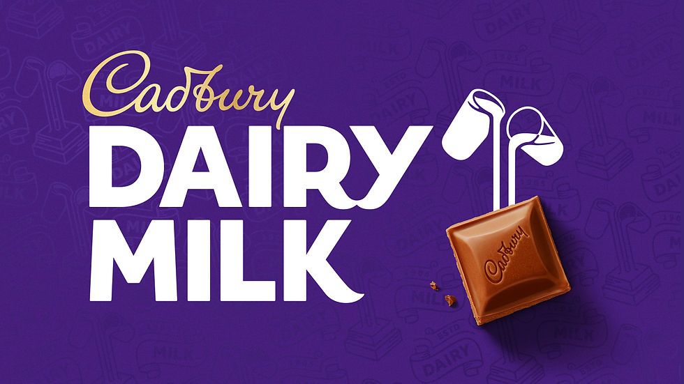

Bulletproof Designing Company, the design agency Cadbury tied up with, tried not to modify it much played safe side not to risk its brand value as the old logo was globally recognized. Although the new logo is more appealing compared to the old one. The revitalization of the Cadbury wordmark drew inspiration from the hand of founder John Cadbury himself featuring a tasty loop in the “b” and a slightly more swashy “y”, to create a beautifully crafted signature with a more contemporary feel. The logo lies in between the fine line of heritage and modernity and the new baseline alignment logo seems more open and contemporary.
Let's look at the visual created by Bulletproof as apart of the rebranding strategy and then we'll look at the meanings and objective of the campaign.
The iconic Glass and a Half logo has also been redesigned so that it links directly with the chocolate chunk, further emphasizing the quality of the ingredients and the classic creamy taste of Cadbury Dairy Milk that the nation loves.
Overall, the new identity celebrates the brand’s inherent goodness and generous spirit with a distinctive and modern twist. The new iconography and typography aim to reinforce the unique Cadbury Dairy Milk assets and product story at a time when consumers are looking for more natural, authentic, and higher quality offers.

As interest and demand for sustainably sourced products increases, Cadbury wanted to share more about its long-standing commitment to cocoa farmers and the environment, on the new packaging. The Cocoa Life sustainability programme has been integral to the brand for the past eight years helping to train 140,000 cocoa farmers to look after the environment; helping to plant 1.2 million trees in cocoa regions across the world and helping to ensure cocoa farming is a viable livelihood. This has ensured that every Cadbury Dairy Milk chocolate chunk is 100% sustainably sourced.

Ben Wicks, global brand director at Cadbury, said,
"Cadbury Dairy Milk is a true icon both in the UK and worldwide - it's the nation's favorite chocolate brand, with a rich heritage and feeling of nostalgia for many consumers. Over the past three years, we have been reconnecting with our roots, which is why the new identity is grounded in the original intent behind the brand _and celebrates our unique product credentials and iconic distinctive assets in a modern way".
The logo along with the packaging of all the variants and wrapper patterns got a total transformation giving it a completely new and refreshing look. Here are some of the designs and patterns created by Bulletproof:


Nick Rees, global creative director at Bulletproof, says:
“We wanted to recapture the very spirit of Cadbury, so part of the research process involved digging into the Cadbury archives to reinterpret its iconic visual cues to create a modern and playful identity that still has a clear recognition for consumers.”
So, after unfolding all the meanings and reasons behind the new rebranding the question that arises here is, does all of this justify the million-dollar spent?
This question's answer can only be found out if we look at the purpose behind this rebranding. According to, Nick Vaus, a partner and creative director at Free the Birds,
"Like many other heritage brands, Cadbury will be facing challenges from private labels and newcomers to the market. To stand out on the shelves and to compete through digital channels, the look and feel need to be simple, elegant, and exciting."
So, to precisely answer the query, Cadbury has played it safe by investing this bunch of money by safeguarding itself from various other players. All these redesigning and modifications will make the brand all the more attractive to the eyes of the consumer and the appeal will also be higher. The aesthetic part will play a major role in deciding the fate once the consumers can lay their hands on the packet after its launch this year. If the consumers find its looks to be appealing and pleasant it will make a lasting impression on his mind thus setting a firm and definitive cue and whenever he feels like having a bite at a chocolate bar, the aesthetic packaging and the design will serve as a cue for the consumer which will ultimately lead him to buy a Cadbury to satisfy his urge for the chocolate bar. Here the major role will be of the tri-component model of consumer behavior. The sole purpose of the brand will be to have:
1. Cognitive: A positive perception and knowledge about the brand which Cadbury already has acquired through direct experience and related information from various sources. The rebranding will only ensure the knowledge and experience together becomes a belief
2. Affective: The consumer's emotions and feelings about the particular product or brand and in this case Cadbury has managed to maintain a positive relationship with its consumers since its inception and this, in turn, helps the people build strong feelings and emotional attachment to the brand
3. Conative: The likelihood or tendency that an individual will undertake a specific action or behave in a particular way with regard to the attitude object. It is the consumer’s intention-to-buy a brand. Rebranding now will only help Cadbury establish a strong foothold in this industry by providing consumers with so many cues and thus setting up a positive attitude with the consumers.
Being a market leader also gives them a fair and clear advantage to think and plan beforehand when the other competitors have just started gaining pace and are capturing some market share. All this helps them again create a buzz in the market and reinstate its position back at the top while the followers and challengers find it challenging and economically draining to match that pace.
Having said all these and analyzing the history of rebranding and its origins, I too am excited to get a hold of this new packet and see it in front of my eyes. So, the new brand identity launch kicks off in Australia in May, followed by South Africa and Malaysia later in the year, with further markets, including the UK & Ireland, launching at the beginning of 2021.
Can't wait.
Comments